

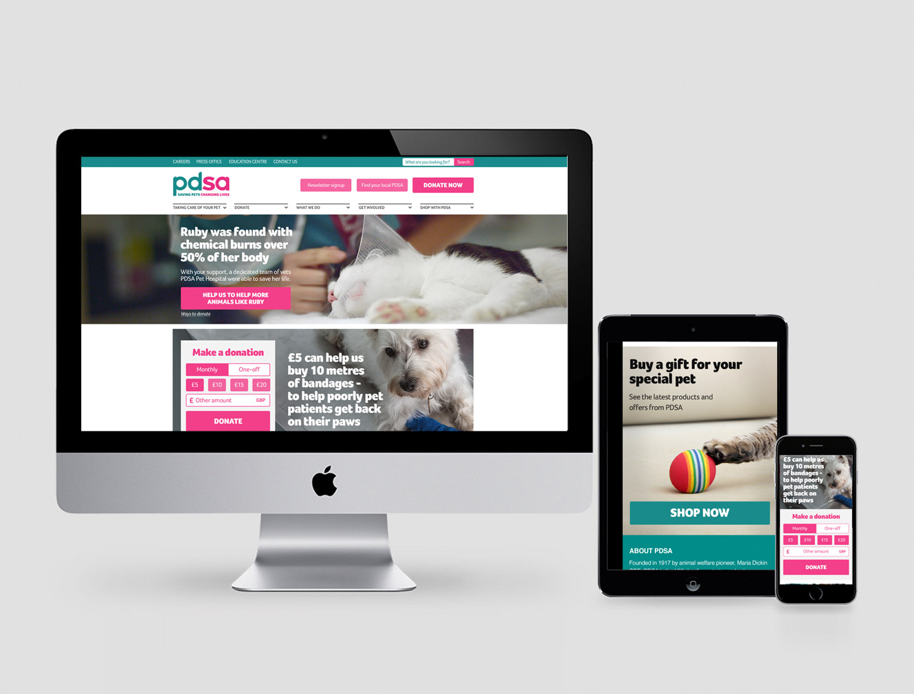
It needed a visual makeover, bringing in a modern, yet
suitable, styling for their key audiences. It also needed to
be easy to use across multiple devices, and direct the user
journey through relevant key points all within a restricted
CSS system that was already in place.
All of which I artworked across responsive devices, to be built by a third party dev team.
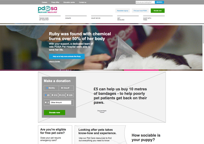
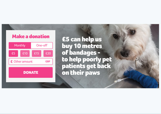
Working closely with the strategy and planning teams, we opted for a less traditional charity layout, which typically focuses on short term donations. Instead, focusing on how PDSA can increase a long term relationship with users and increase not just donations, but encourage more alternative ways to help the charity.
The core user experience was developed by a specialist agency, and given to me to work up. I applied user interface design, and further user experience knowledge to flesh out further detail. The overall look has seen a considerable facelift, with more consistent styling in imagery and tones of colour, as well as applied guidelines to typography, hierachy and pixel perfect positioning.
All of which I artworked across responsive devices, to be built by a third party dev team.